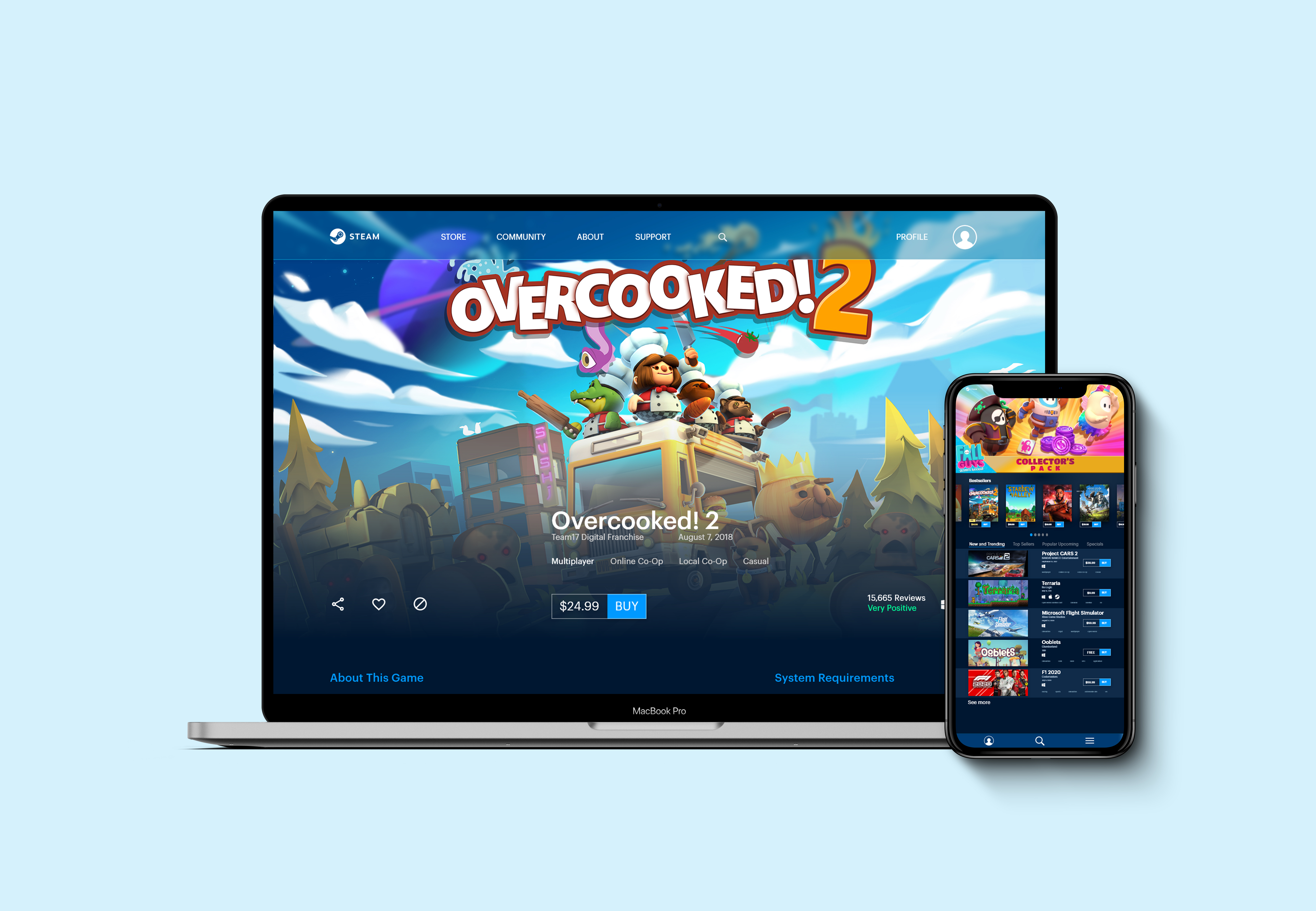

The current design of steam is extremely overwhelming. There is a lot to take in at once. I wanted to give steam a facelift while also making it more easily consumable while also keeping ease of navigation as a top priority. I wanted to keep the overall feel of Steam intact. I kept a darker look while reusing blue as the main color to achieve this. However, I added some more fun elements to liven it up while also organizing the information.
You can see from the screenshots of Steam that it is currently a mess and your eye is unsure of where to go
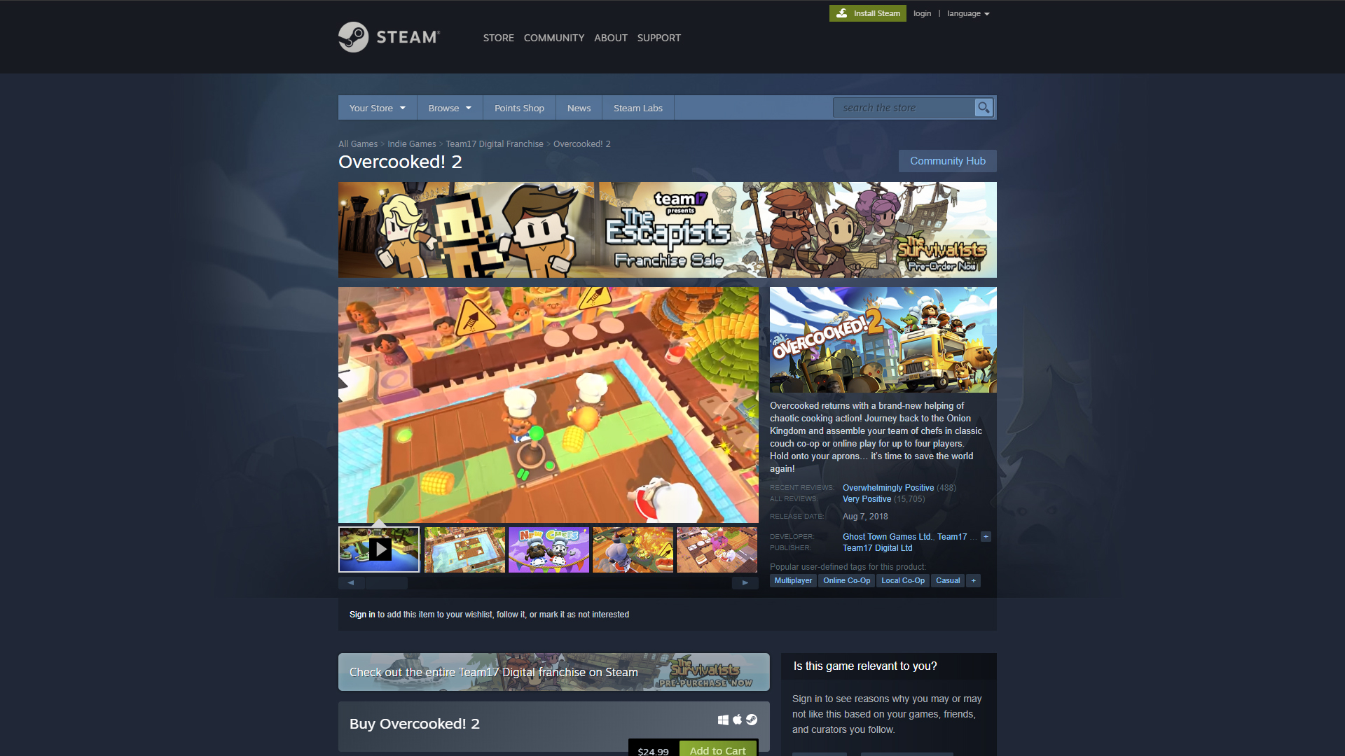
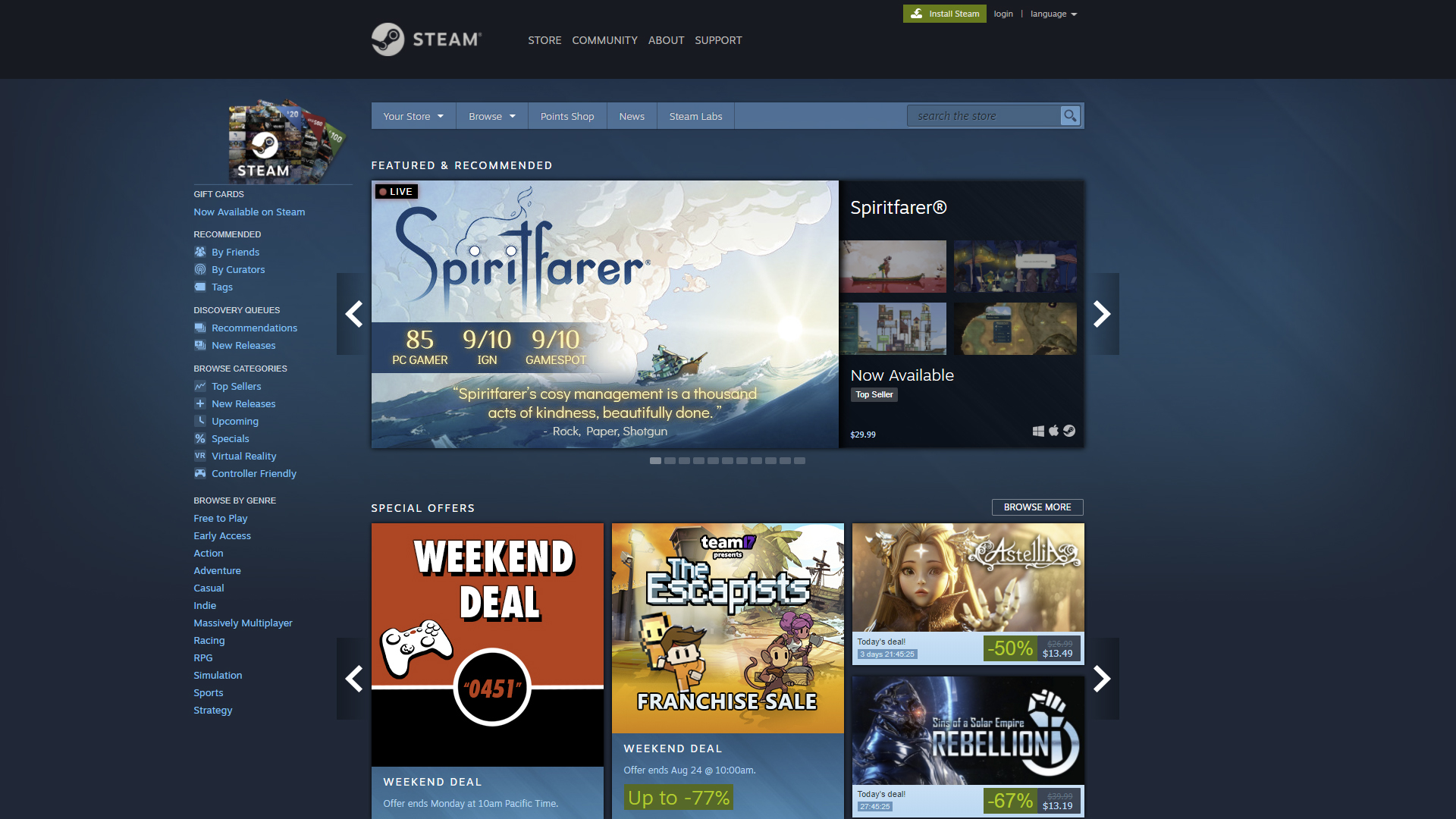
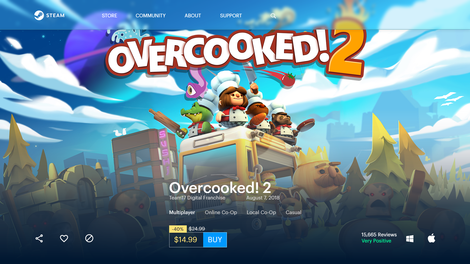
When surveyed, people agreed that the most important aspect of the game page was the game itself. It was crucial that the game was the thing that got the most attention. Afterwards came price. Further down the list were written reviews. The more important part of the review was to see the overall rating of the game at a quick glance. My designs and iterations reflect upon this.
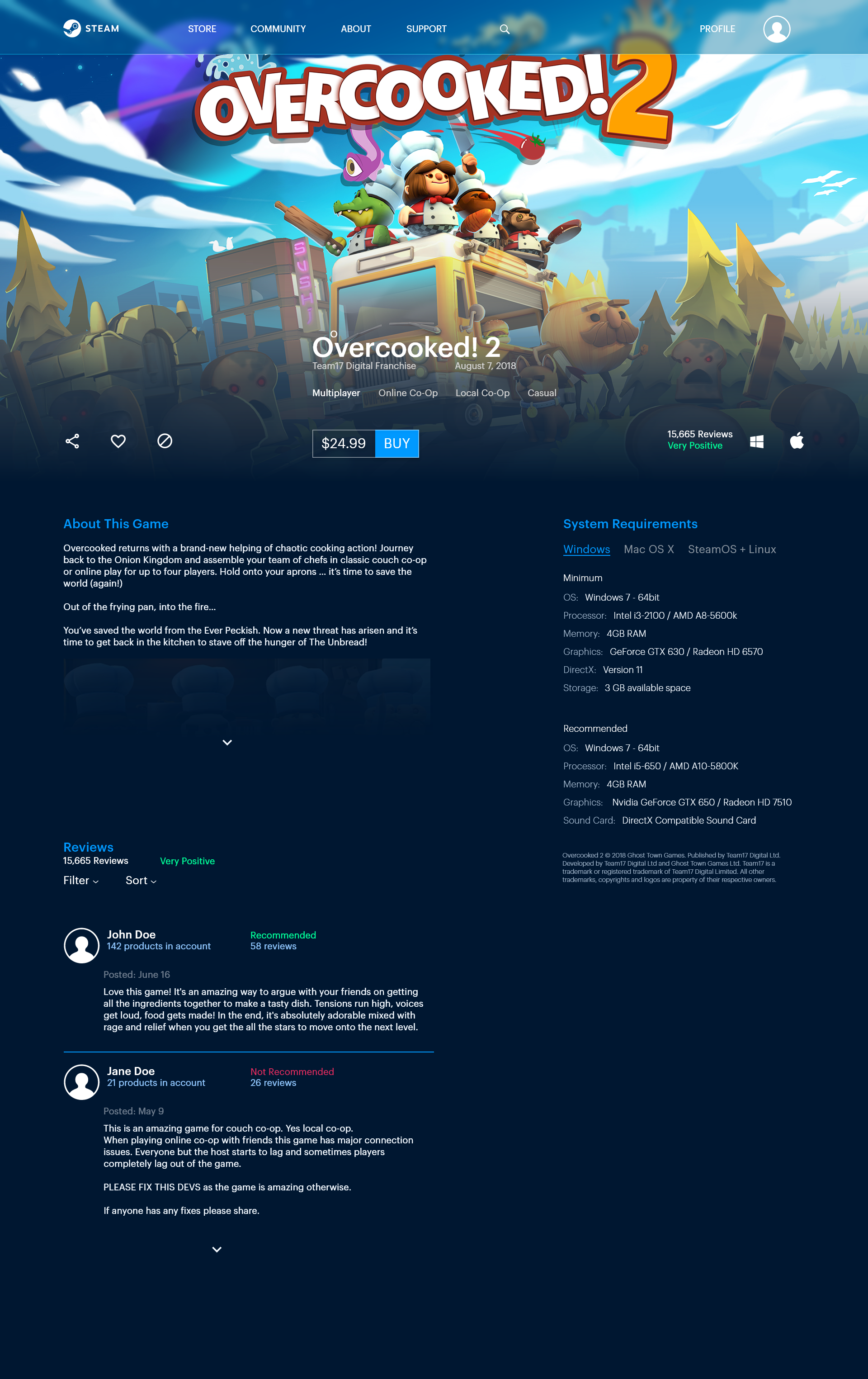
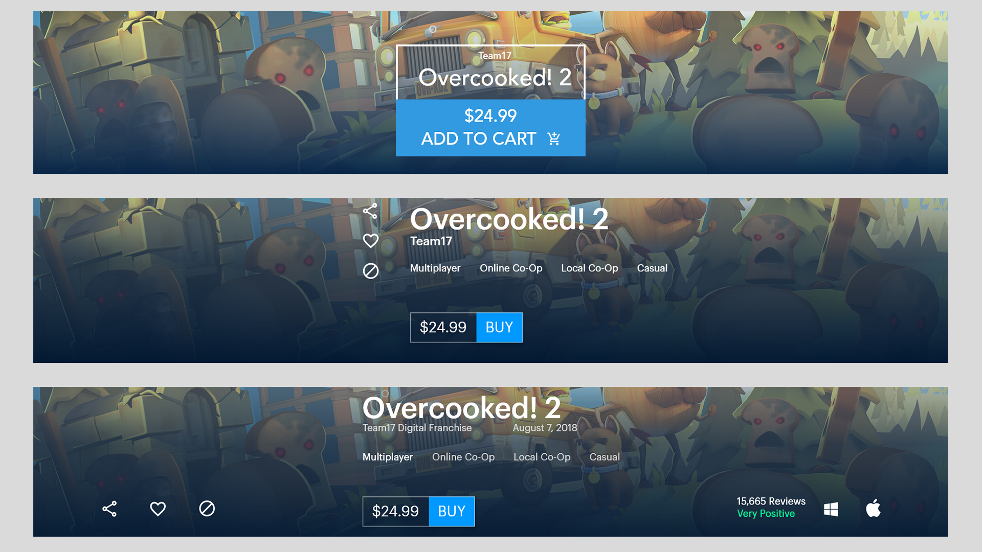
Experimenting with the Buy button and placement of surrounding elements.
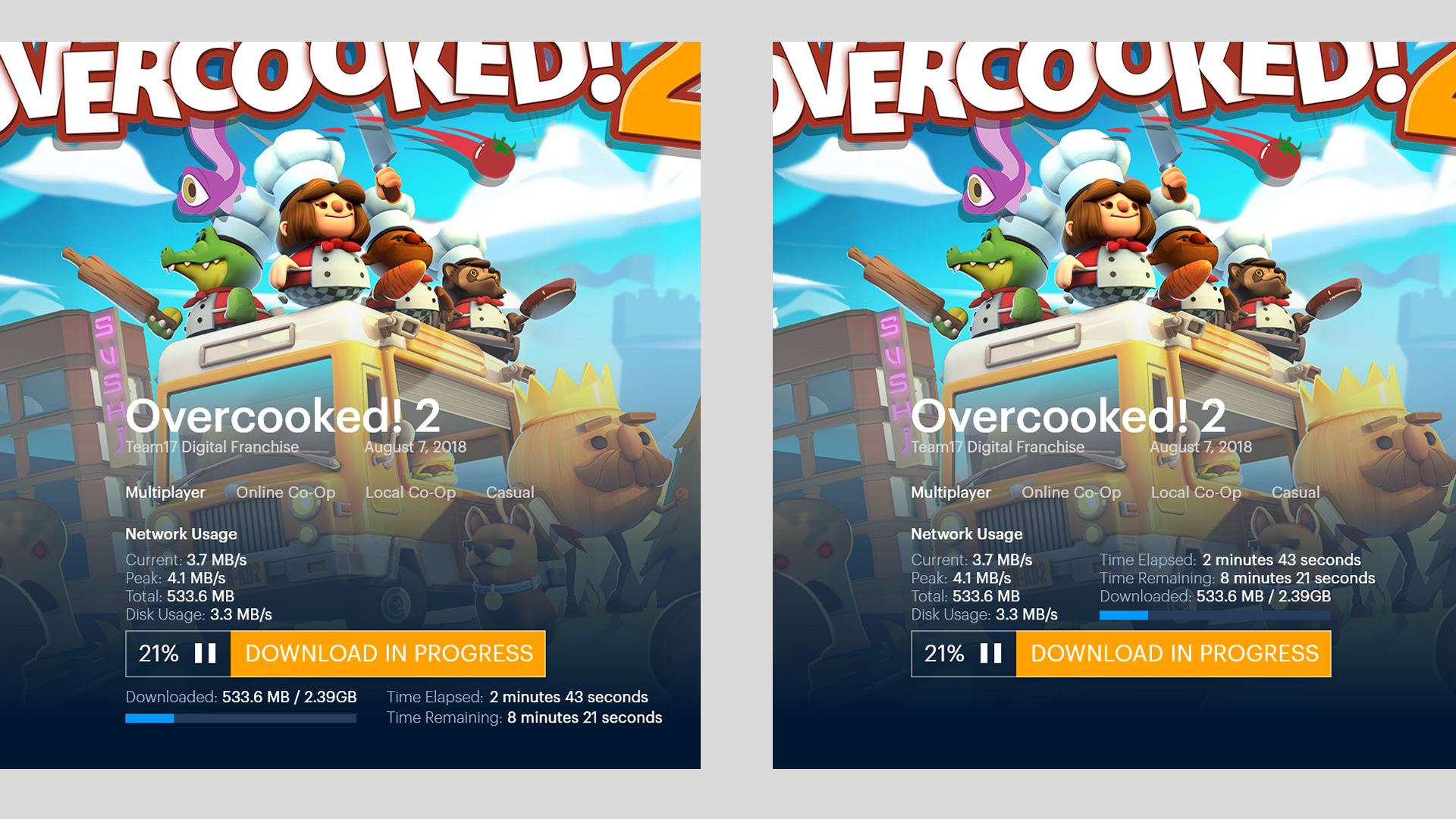
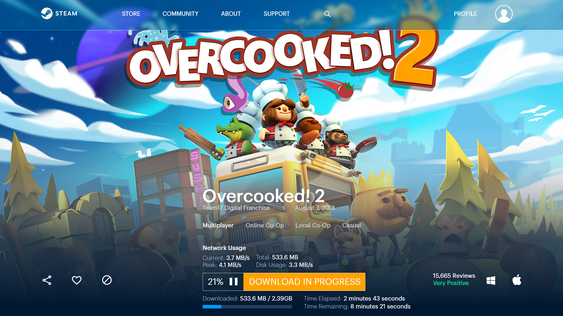
Figuring out placement of download progress bar and accompanying data.
Designing a new homepage for desktop and mobile. Updating Steam to feel more energetic and friendly while still maintaining aspects of its current branding.
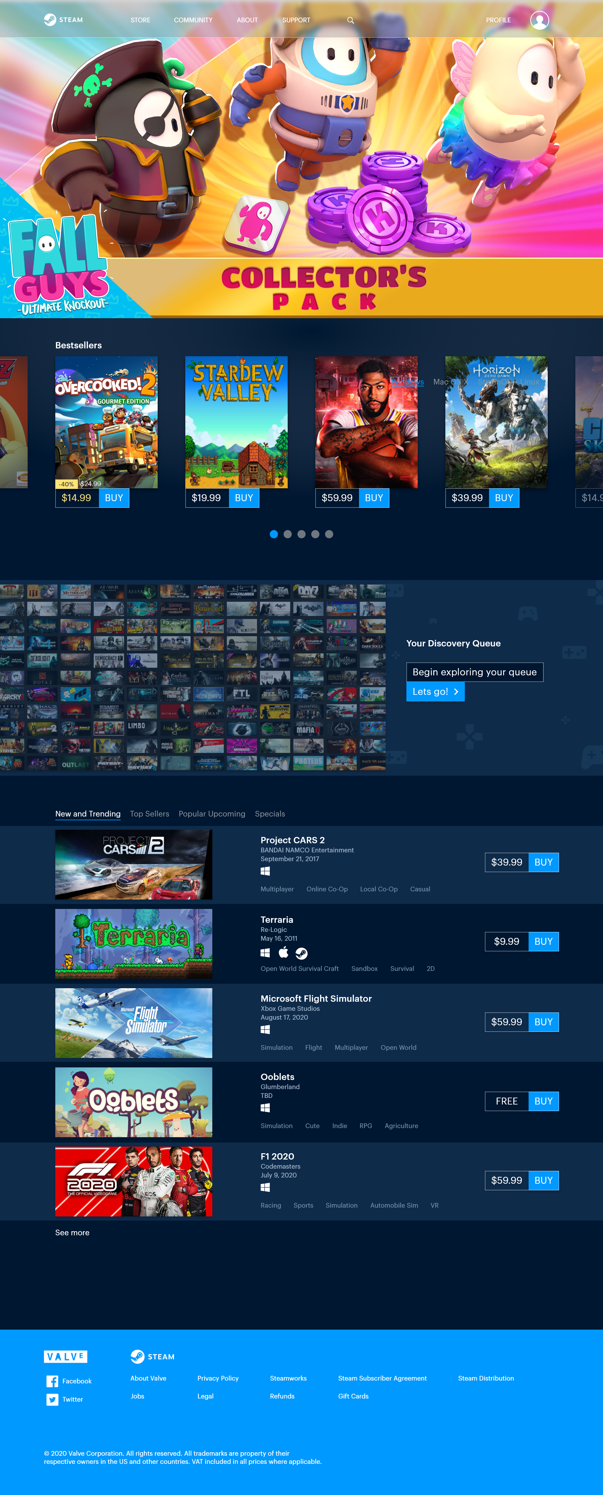
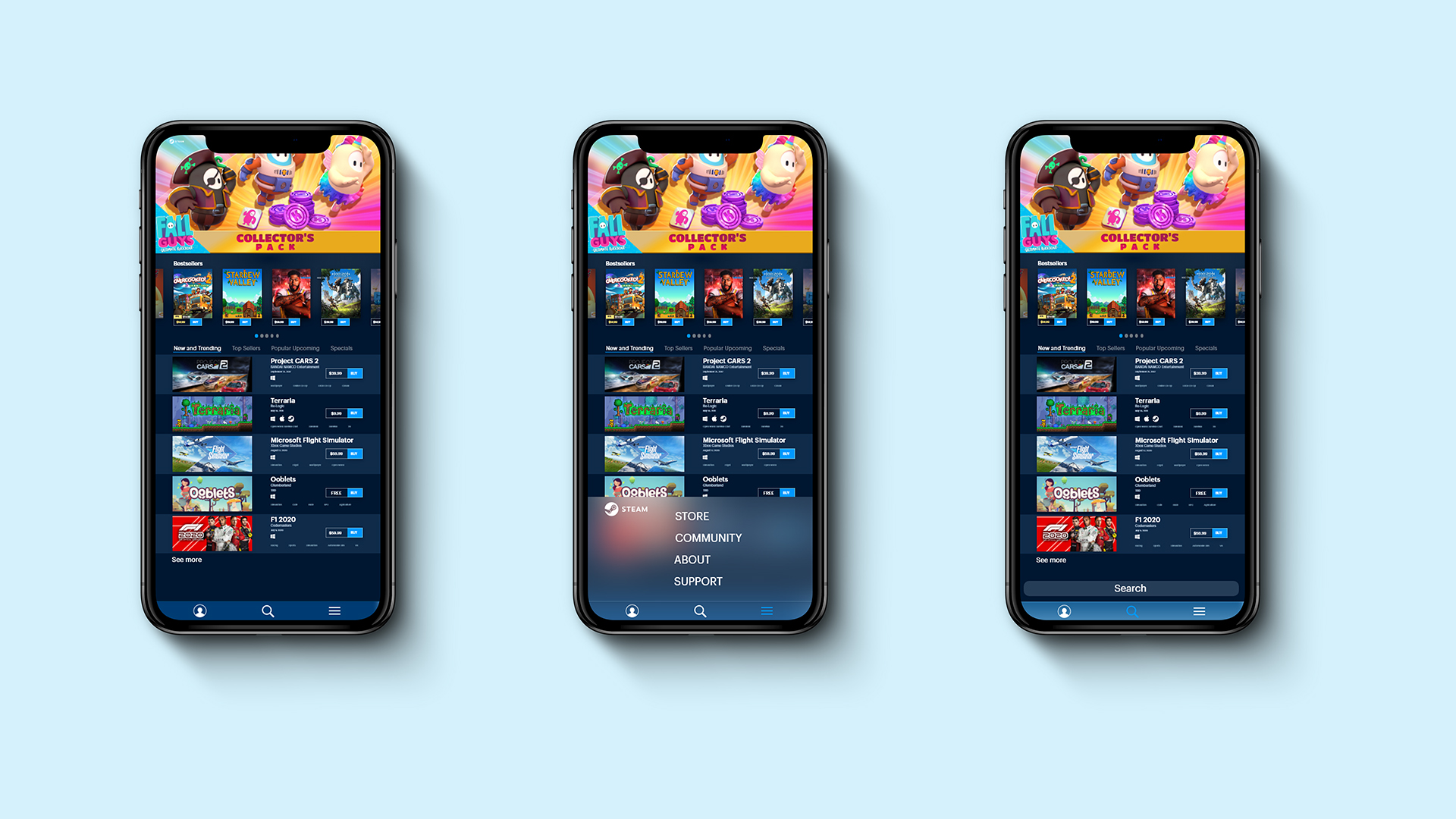
The new design of Steam maintains key aspects that keep the brand recognizable by the millions of people that use it. It has been updated to use more visual hierarchy and now has slight hints of playfulness to entice the user. It further enhances the user experience that was lacking in the original design.