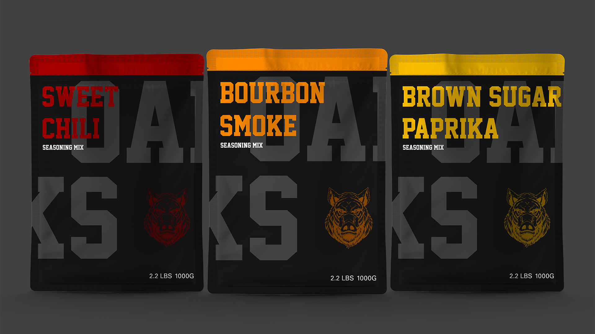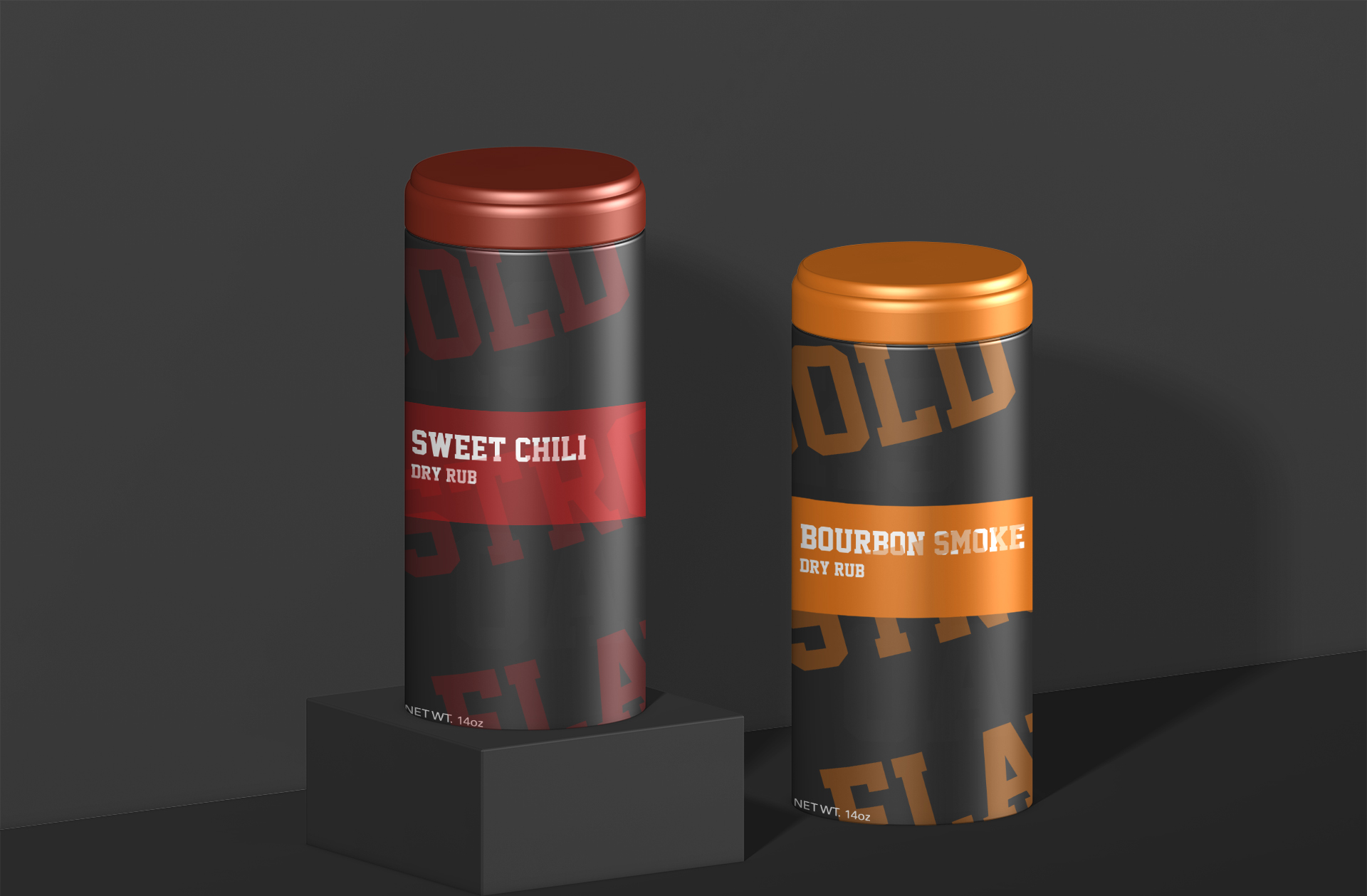

Packaging / Product design for OAKS seasoning. This is my take on a brand that approaches its audience with a bold and loud attitude. OAKS emphasizes its strong bold flavors. OAKS aims to bring unique and interesting flavors to your home.

.png)
.png)

OAKS uses contrast in its design language to emphasize its goals as a brand. Strong bold colors and contrast between text help convey their mission for powerful flavors. With these powerful flavors they hope to bring powerful memories that people will remember.