
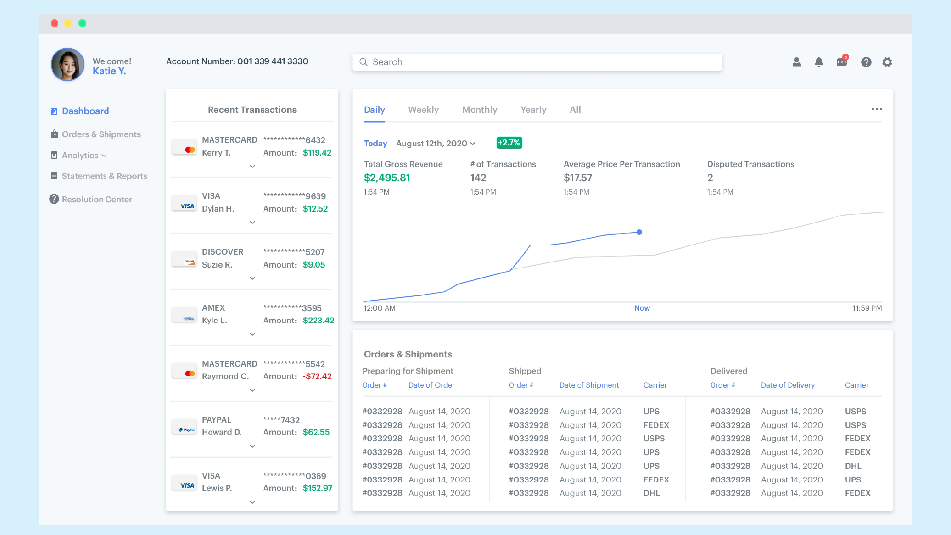
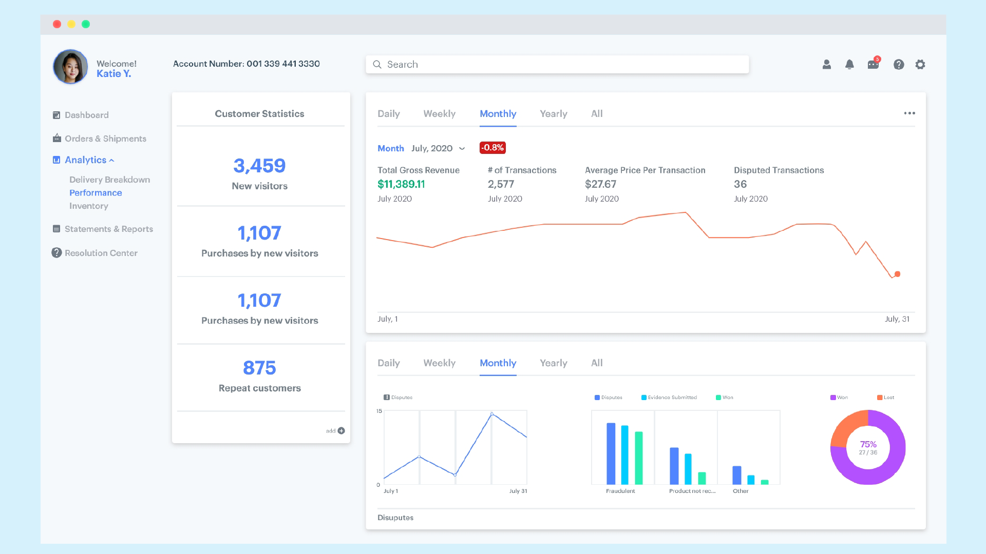
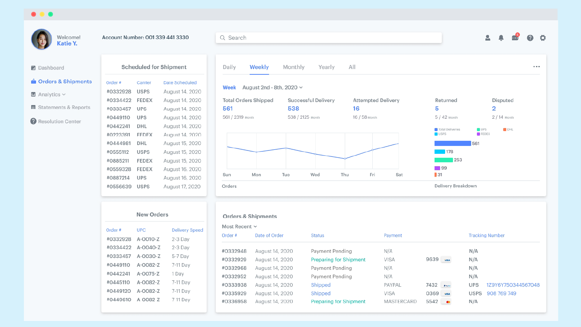
The challenge came with organizing vast amounts of information in a way that would make sense to the user. Things should be easily accessible and should not be frustrating to use. As a dashboard for merchant services there are many data points that must be presented in a way that makes the information easily digestible.
It can look cool or nice but if it does not also function in a way that is organized and convenient then it is a failure
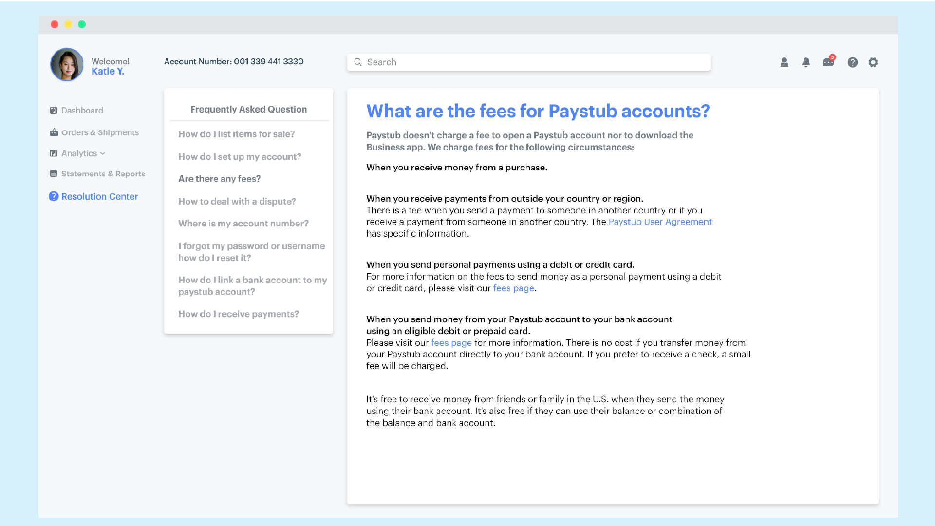
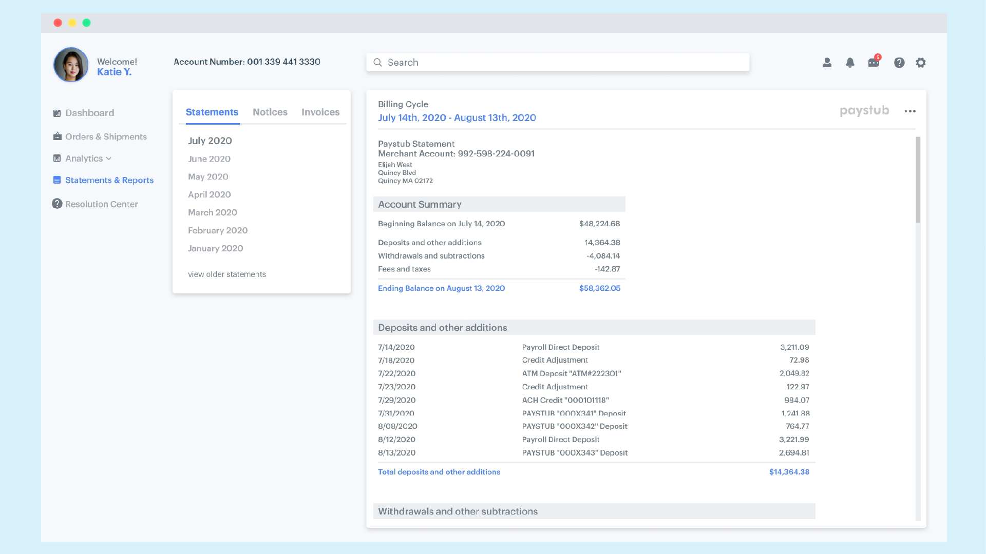
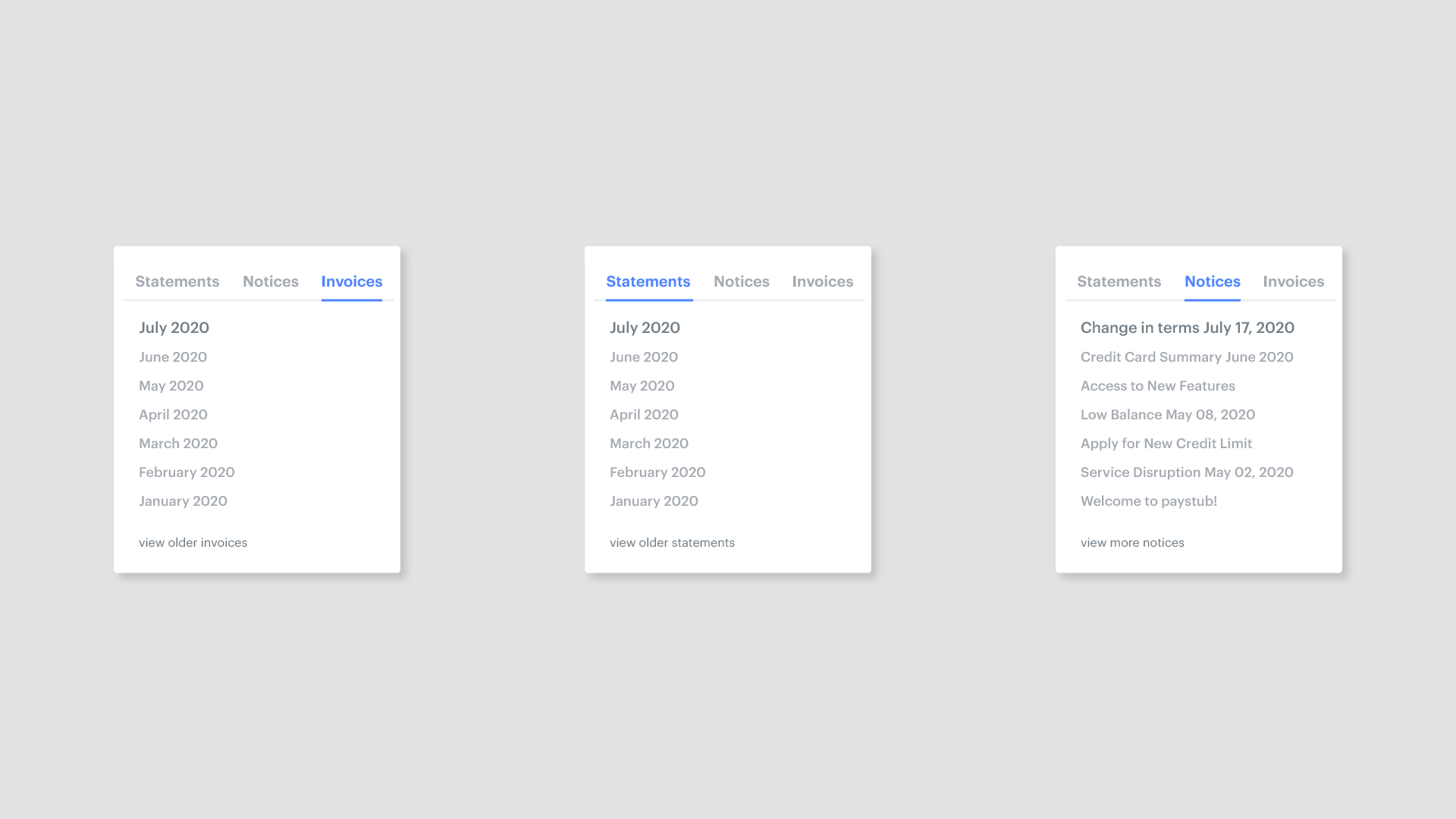
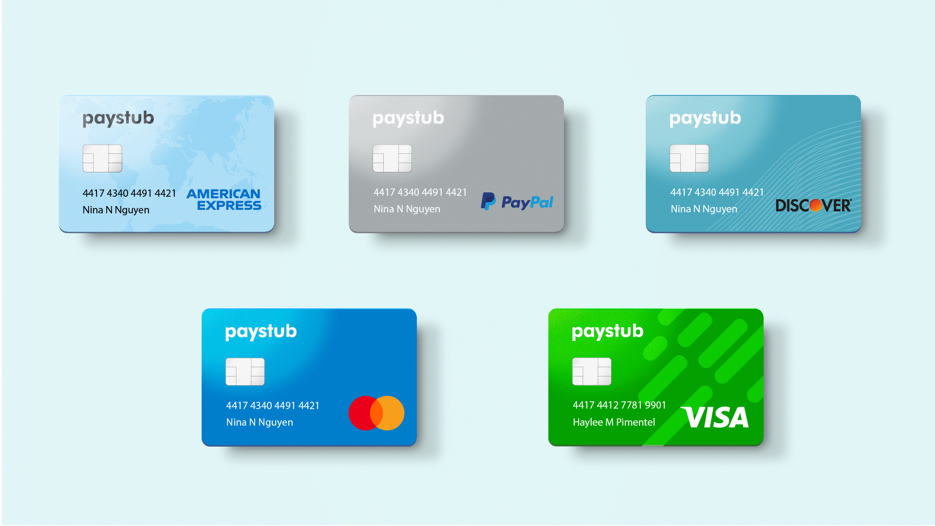
Paystub encompasses not only the experience of the merchant but for the customer as well. Paystub must be usable for both the one recieving and intiating the transaction. It should feel seamless so that there are no extra barriers to entry that may cause a decline in sales.
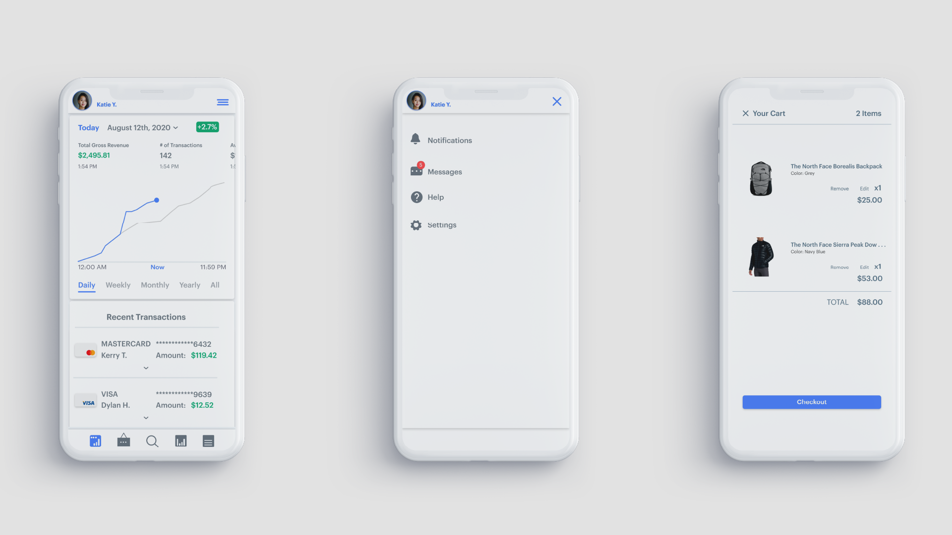
Paystub aims to make buying and selling easier. With the focus on usability it wants to streamline the tracking and resolution of issues that may arise from the selling goods or services. The UI mimics this philosophy by following a minimalistic palette with good contrast using color and hierarchy.